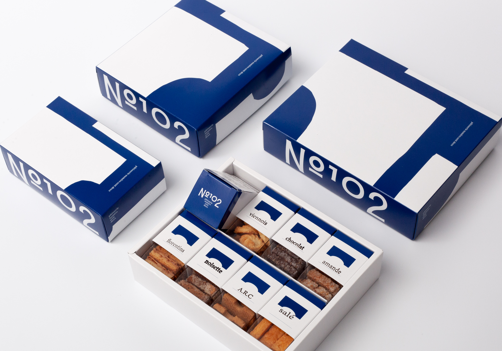
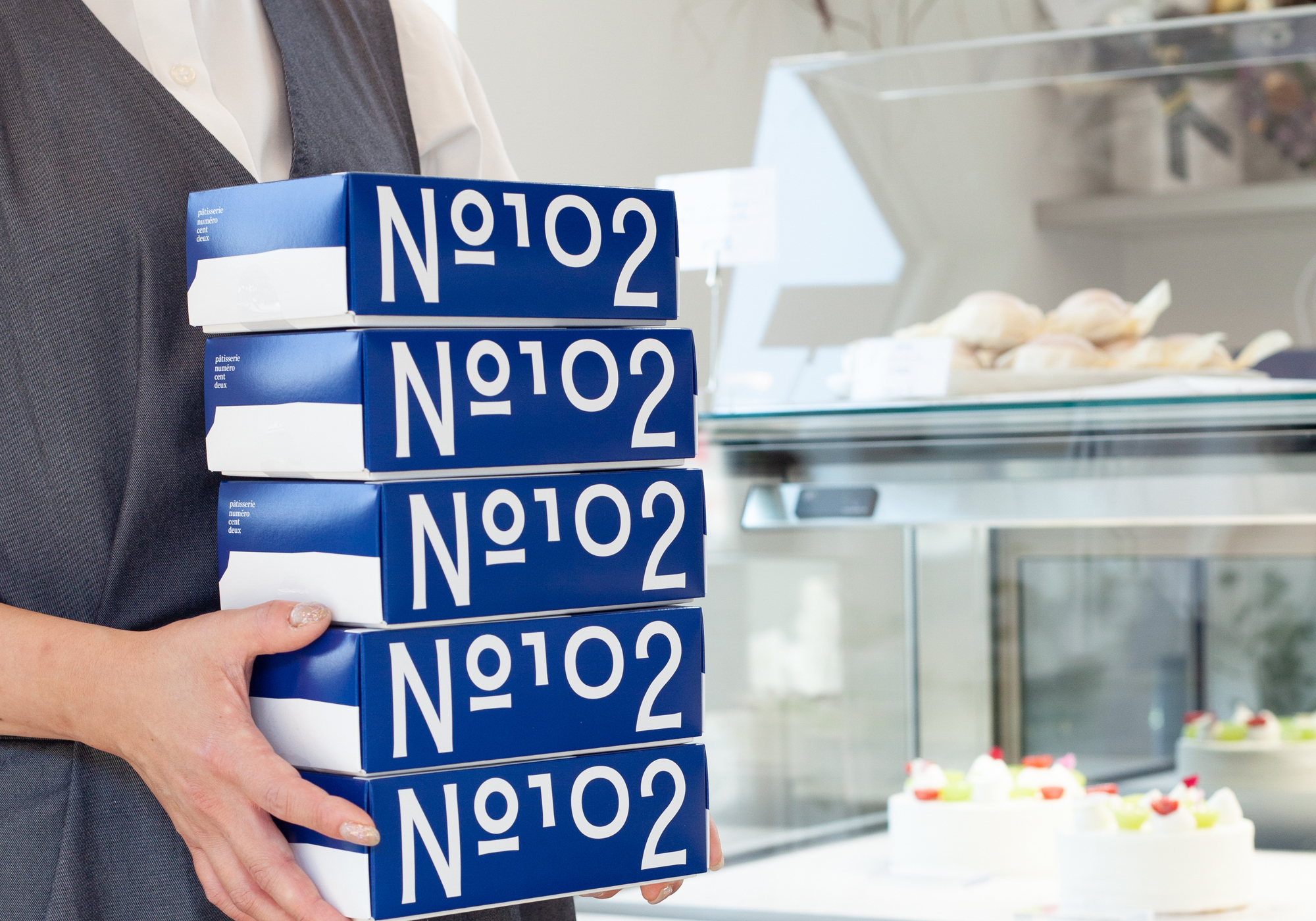
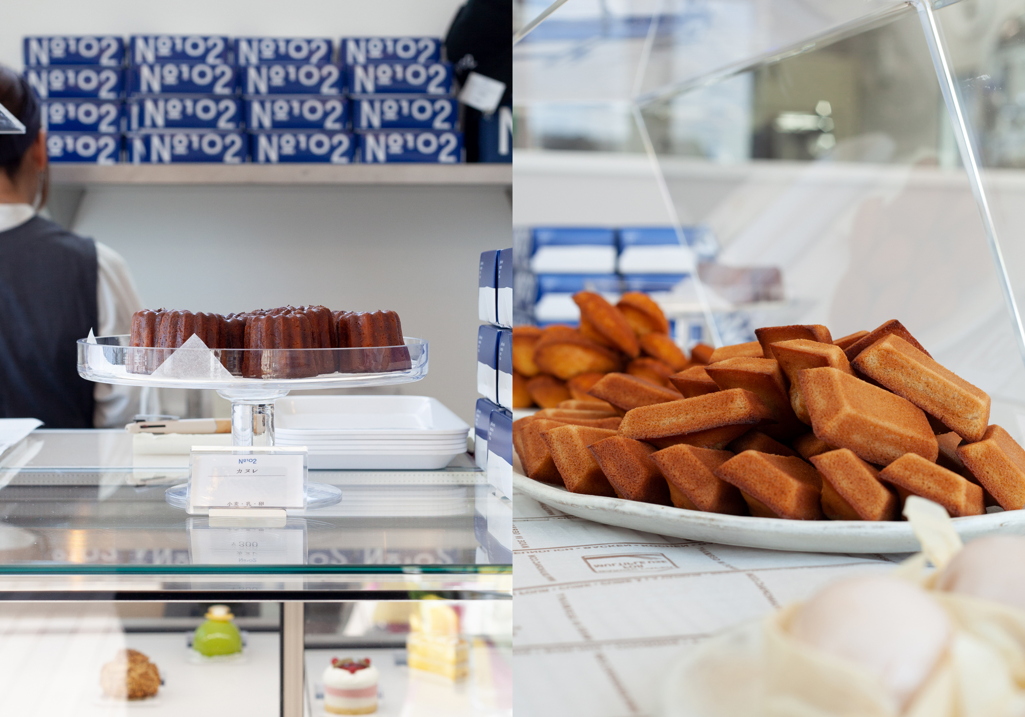
pâtisserie numéro cent deux
茨城県守谷市 パティスリー(洋菓子専門店) ロゴマーク / ブランディング
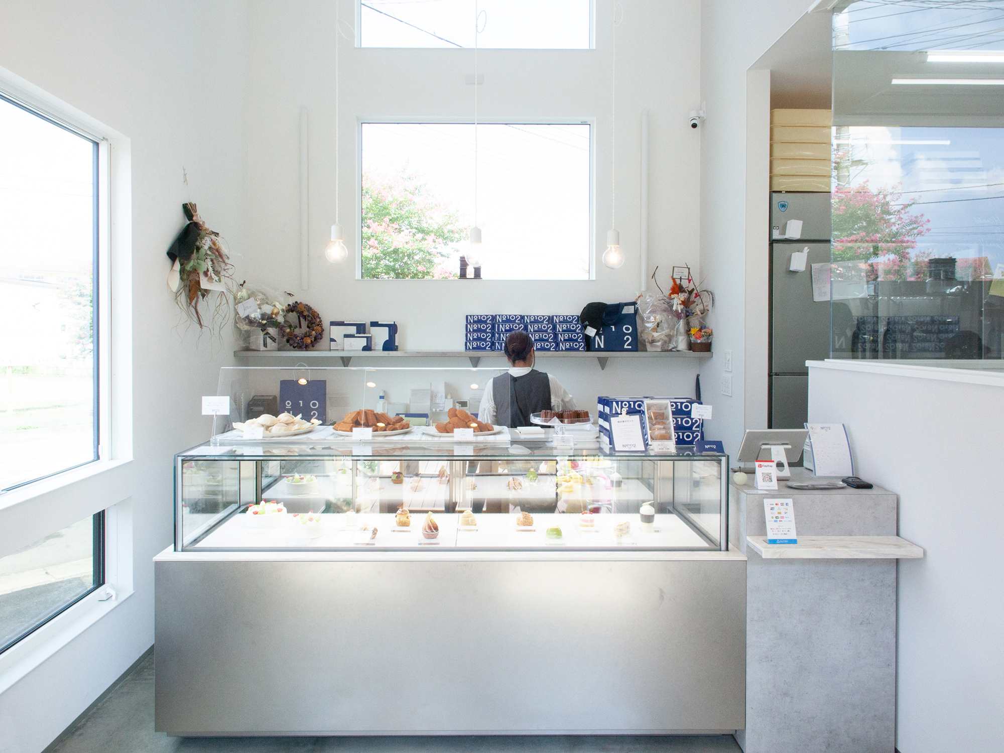
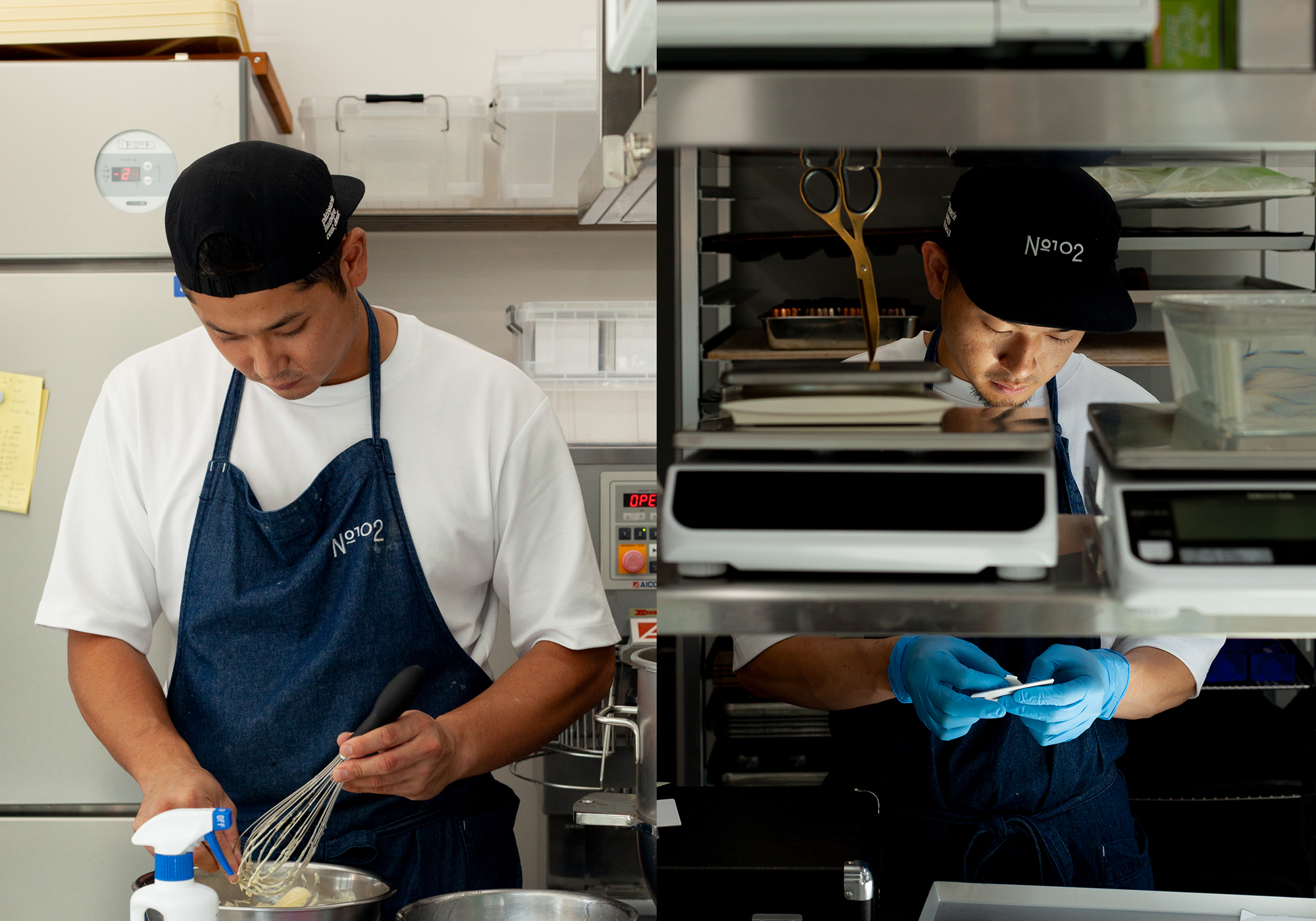
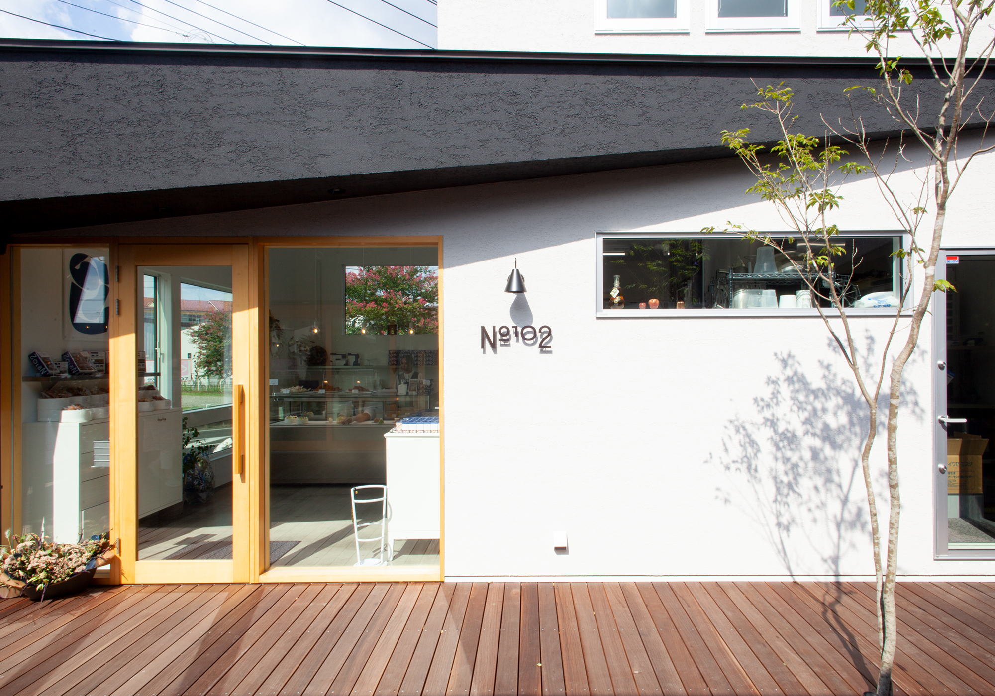
名店から独立したパティシエが作るケーキや焼き菓子の専門店 パティスリー ヌメロサンドゥ 。見た目や味、香りはとても繊細で特別なものを感じることができます。「おいしいを求める人全てに」をコンセプトに、日常とはちょっとだけ距離を感じられる、そんな心地よさをアイデンティティとして表現しています。
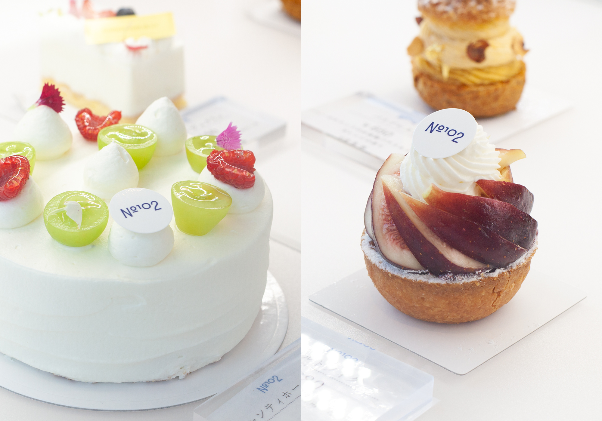
A patisserie opened by a chef who spent his career at a famous confectionery.Delicate cakes and baked goods that look, taste, and smell delicious all make you feel special.
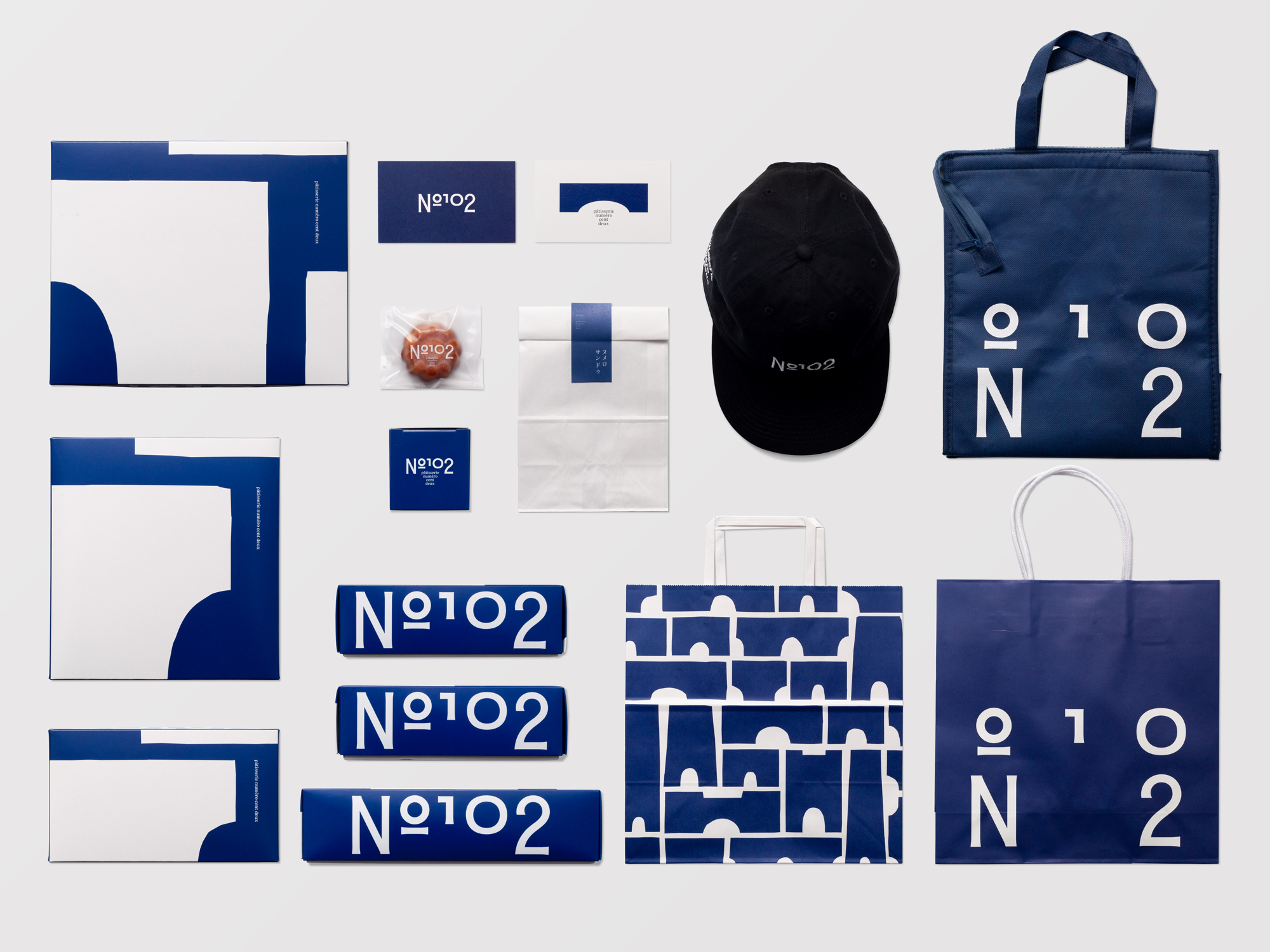
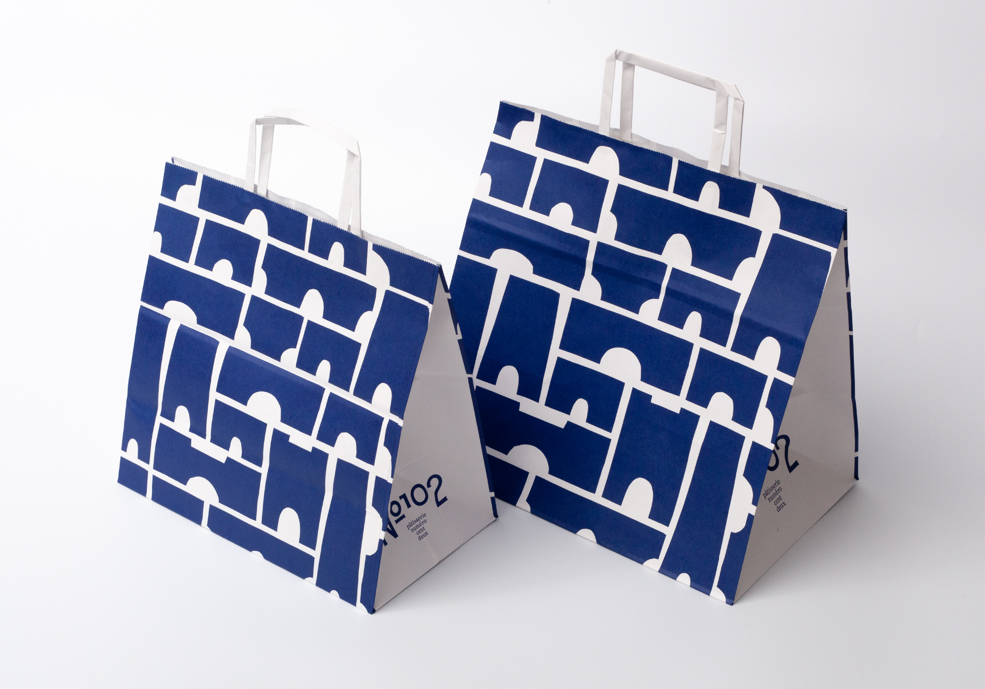
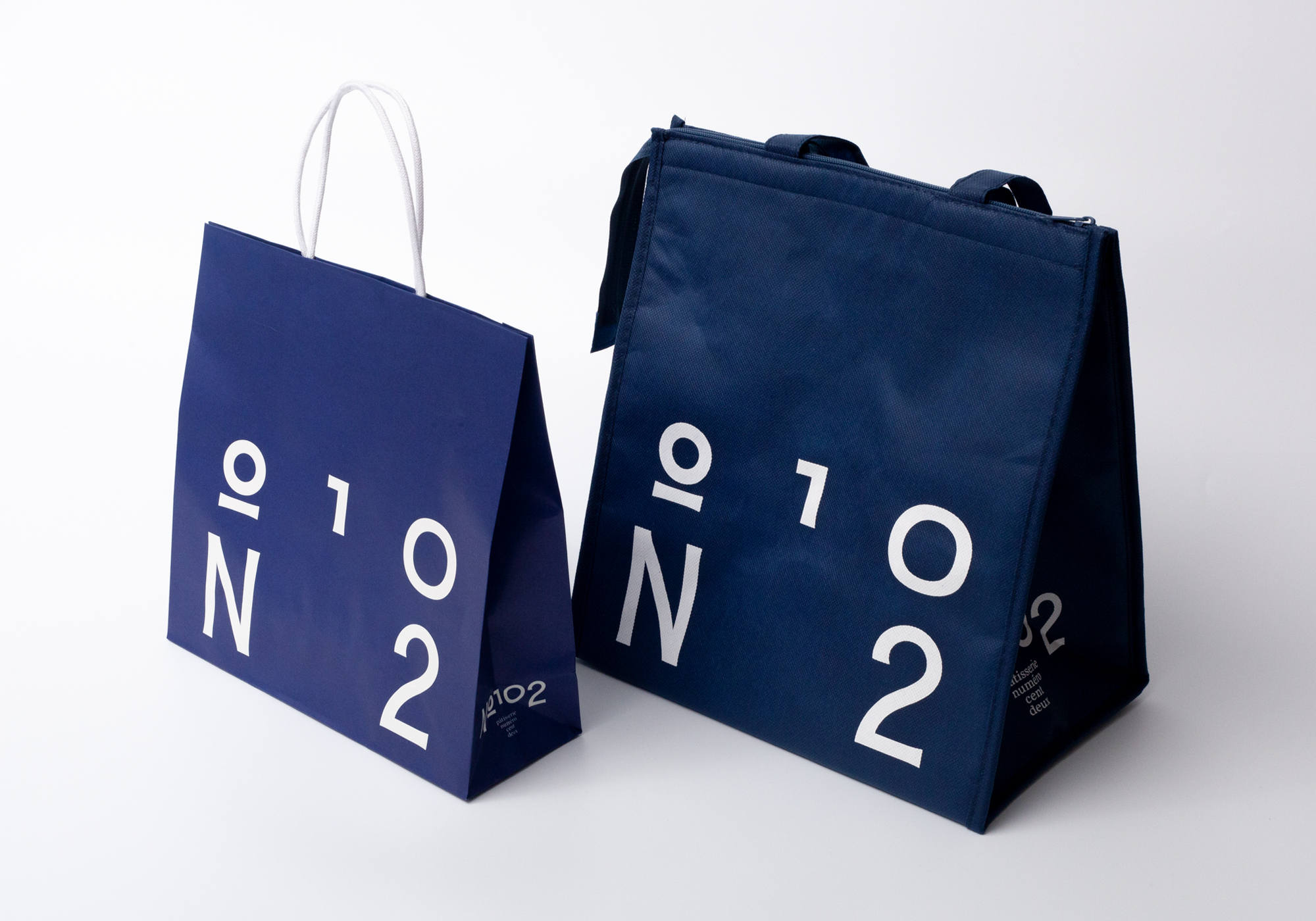
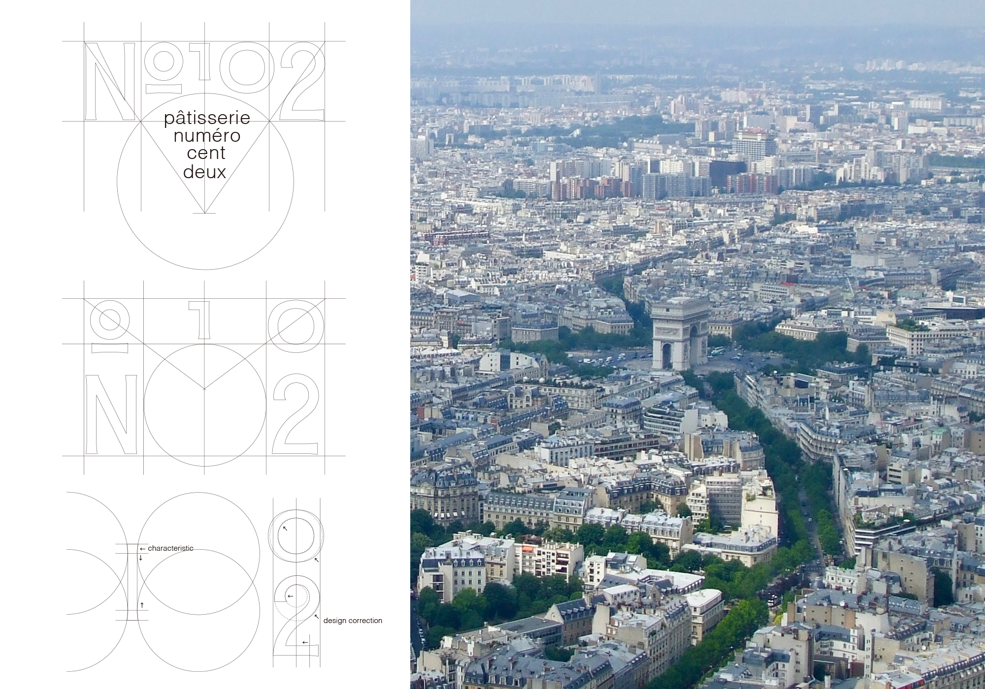
The logotype is the original font of the store name.The original logotype was repeatedly reworked to incorporate a Japanese taste, like the movement of a brush stroke, into the form, and the ideal typeface was completed.The typeface also has a distinctive arch shape, which is central to the branding design.In this branding, the entire design is based on the concept of a gate or arch.
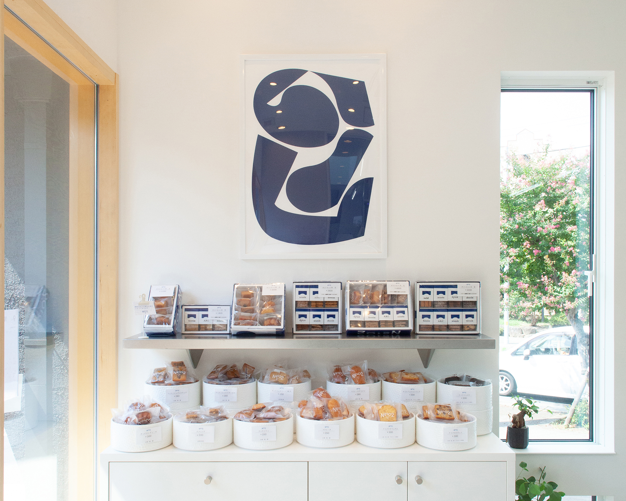
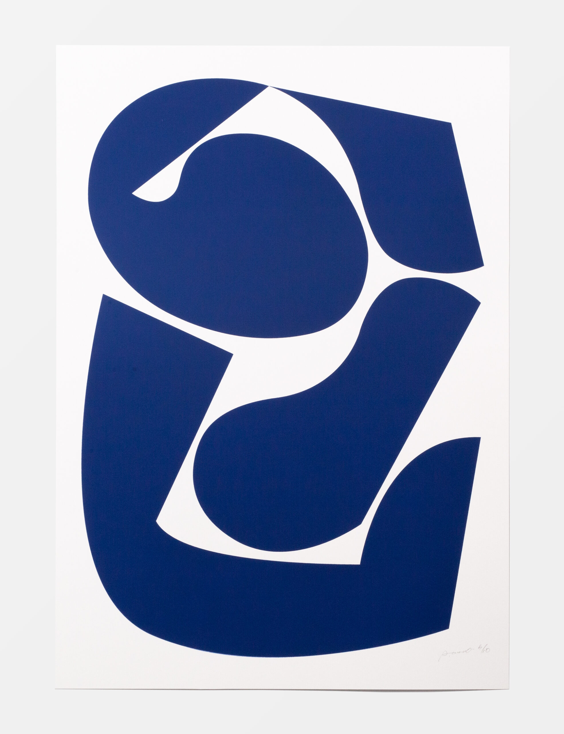
It is hoped that it will serve as a symbol for people to gather, or as a place that connects people to each other.The shapes used in the design were completed by Paper-cutting of the gate’s symbols with the chef’s children.In order to create our own original symbol that could not be found anywhere else, we were concerned with free thinking and free shaping.The shape created with free lines became something special and unique to us.The brand color blue also symbolizes this concept.
